Tuesday, March 03, 2009

VI Makeover Edition - Part 1

For a long time, I've been meaning to do a series of posts I call the "VI Makeover Edition" where we take a VI front panel from "drab" to "fab!" :-)

I helped "spiffy up" a VI for an NI Week keynote demo last year. It is a graphic equalizer powered by LabVIEW MathScript. You can watch the demo video on ni.com.

The goal was simply to make the VI look better on the big screen, and make it easier to see the operation of the controls from the back of the room.

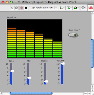
The original VI looked something like this:

And the final VI looked something like this:

Some of the tips and tricks I plan to cover include:
  • VI panel wallpaper
  • Background images and locking
  • Customizing the parts of a slider control
  • Adding decorations to controls
  • Using transparent color
  • Gradients and graphics
  • Grouping and alignment
If you want me to cover these in a particular order or have questions in advance that I should cover, please let me know!

Labels:

Thursday, August 30, 2007

Mixed Checkbox


Another new feature of LabVIEW 8.5 is the System Mixed Checkbox.

You often use checkboxes to set an attribute of an item. But sometimes you can select multiple items and set their attributes together.

The mixed checkbox is useful when you need a checkbox with a third state: "some of the selected items are checked and some are unchecked."

Check out this short video for a demo.

Labels: ,

Wednesday, May 30, 2007

User Interfaces

I was absolutely delighted to see Tomi Maila blog about UI design on EXPRESSIONFLOW and Jim Kring blog about mocking up UIs and human interface guidelines on Thinking in G.

The process that Tomi describes is very similar to the one that I use:
  • Understand the user, what she's trying to accomplish, what decisions she needs to make and what information she needs to make those decisions.
  • Mock-up UIs, either on paper, whiteboards, or VI panels (but with no diagrams!)
  • Usability test the mock-ups.
  • Repeat until satisfied with the design.
Of course "mock-up UIs" sounds simpler than it is. But it gets easier with experience. Over time, you learn things that help you choose the right components. For example, rings and listboxes both let the user choose an item from a list. A listbox is easier to browse but a ring takes up less screen real estate. Don't be afraid to try various components in multiple paper mock-ups and see what parts work better than others.

Labels:

Sunday, March 11, 2007

LabVIEW UI Tip: the Resize Objects dialog

I recently pointed out the LabVIEW Resize Objects dialog to one of my coworkers and realized this little gem is probably often overlooked.

Have you ever had someone ask you to make all your buttons a certain number of pixels wide and tall?

When resizing an object in LabVIEW, you get a tip strip that shows the object's size, but it takes a steady hand to get a precise value. And resizing more than one object by hand gets tedious.

But with the Resize Objects dialog, it's super easy. Just select the objects you want to resize and choose the "Set Width and Height..." menu from the Resize Objects ring on the VI's toolbar.

You'll see the Resize Objects dialog, which allows you to change the width and height of the selected objects.

Just a few clicks and you're done!

[P.S. I just realized that I forgot to give my buttons proper labels before taking the screenshot. Just pretend the labels are the same as the text on the buttons, please. Thanks!]

Labels:

Wednesday, March 07, 2007

LabVIEW UI Basics: the Checkbox

I often advise people to "know your tools" before doing user interface design. Being familiar with the UI elements that your development platform (e.g. LabVIEW) provides will make it easier to select the right one for a particular application.

Towards that end, I'd like to survey the fundamental LabVIEW controls, starting with the checkbox.

Checkbox Control

Purpose

Allows the user to choose between two options, typically an "on/off" or "yes/no" style decision.

Appearance


Part List


Subtleties

When you click on the boolean text (with the operate tool), the checkbox changes state the same way that it does when you click on the box. The label, however, does not operate the control. I usually hide the label and change the "OFF/ON" boolean text to a description of the option, such as "Use default."

Strengths

This is a widely-used control, and very intuitive. It is compact, taking up relatively little space on the panel.

Weaknesses

The text with a checkbox describes only one of the two options. In some cases, the other state is obvious. If "Do not show this dialog again" is unchecked, it clearly means do show this dialog again. But in other cases, the other state may be ambiguous. What does it mean if "Display results in graph" is unchecked? Does that mean don't show the results, or show the results in a form other than a graph, or something else? In these cases, a checkbox is probably not the right control. I would consider using radio buttons instead.

Labels:

Sunday, March 04, 2007

LabVIEW UI Trick: Panel Wallpaper

Do you ever get tired of the gray panel background color?
Before LabVIEW 8.20, you could put background images in VIs, but they got in the way while editing and you had to make sure they were just the right size.

In LabVIEW 8.20, you can set wallpaper for your panel. Right-click on the scrollbar and select "Properties." (I know, this is an odd place for it, but we couldn't make it a right-click on the panel, could we?)

From the Pane Properties dialog, you can choose from several shipping Background images, or browse to your own. You can set the image to Stretch (grow to fill the panel), Center (stay at a fixed size in the center of the panel), or Tile (repeat the image to fill the panel).

Here's our panel again, but with a brushed metal background:


And, in case you're wondering, the "Pane Properties" is not a misprint. For normal VIs, there is one pane that fills the panel, but by using the Splitter Bars, you can have multiple panes in a panel.

That's all for now. Have fun! But please don't go too crazy. Eye candy is fun where appropriate, but you don't want to make something ugly and difficult to use:

Labels:

Wednesday, October 25, 2006

Demystifying the LabVIEW Color Picker

Ah, color. So integral to a good user interface, and yet also the easiest way to make a VI as hideous as an evil clown.

The LabVIEW color picker tries to help you, but unfortunately it doesn't explain itself very well. So I'm going to explain how the folks who designed it meant for it to be used.


The bar along the top lets you pick pure black, pure white, or any shade of gray in between. These are good choices for large areas, like the panel.

The box at the top right is a T if transparent is available as a selection, and an X otherwise.

The second bar from the top contains muted colors. These are good for medium sized areas, like controls.

The third bar contains saturated colors. These are for small areas: LEDs, graph plots, etc. Please don't overuse these bright colors, or everything on your panel will scream for visual attention so much that users won't know where to look first.

The User row of boxes contains colors that you can define in Tools>>Options. These are handy if you want to use the same RGB colors frequently.

The History row of boxes helps you re-use colors that you selected recently.

The box at the bottom left shows you the selected color (and is split into two sections for foreground/background color when applicable).

To the right of that is an icon that tells if you the selected color is an RGB value (color circle icon) or a symbolic color (stacked rectangles icon).

To the right of that is either the RGB value or the name (for User colors and System colors).

At the bottom right is a button that brings up your system's color selection dialog.

Now, you may noticed I saved one section for last: the System section. I talked a little about these in my previous post. When you use these colors, the color that you see is only the current value of the color. The user can change appearance properties in the system (outside of LabVIEW) and remap these colors to whatever he or she wants.

The boxes are really three pairs. In each pair, you have a color and then the color for text that goes on top of that color. The three groups are: panel and object, window, and highlight.

Confusingly enough, window is not the color of the window. That's panel and object. "Window" color is used in places like listboxes. Why is it named the way it is? I have no idea. [11/15/2006 Correction: I found out that the "window" color refers to the "client area of a window," such as the document area in a text editor. Listboxes actually have separate symbolic colors but they are often set to be the same as the window colors].

So, there it is. The LabVIEW color picker's mysteries revealed. I hope some people find this useful.

Labels:

Tuesday, October 17, 2006

Looking Like LabVIEW

Ideally, you should first design your user interface without worrying about the visual design. Make sure the right controls and indicators are there, that they have the right names, and that they're in the right place.

But at some point, you have to decide on a style. With LabVIEW, there are basically three options:
  • You can use the controls and indicators on the top-level palette (which became the Modern sub-palette in 8.x).
  • You can make something that uses the colors and styles of your platform.
  • Or, you can make something completely customized with your own graphics.

Each has pros and cons.

The first option is super easy. The "Modern" controls and indicators were designed by professional visual designers, and they look good together. But, anyone who's familiar with LabVIEW will be able to recognize the tool that you used. Some people complain that they don't want their applications to "look like LabVIEW."

Making a "system" UI is difficult to get completely right. When you use the system controls and the system colors, you have to think about everything more abstractly. You're not placing that listbox. You're placing a listbox. The frame, the scrollbar, the font, the colors... everything can change out from under you, and you have no control over it whatsoever. You also don't have a complete set of controls and indicators. Microsoft hasn't defined a system graph indicator, so LabVIEW can't offer it. The best you can do is create controls with similar fonts and colors, that blend well with the system controls. [Here's a tip: if you need a control for a system style UI that isn't on the palette, see if you can find a custom probe that has it. We've made system-like graphs and arrays for the custom probes that ship with LabVIEW].

A word of warning: do not mix system style with modern style! If you're doing a system style UI, you have to do it 100%. System colors change based on user preferences at the OS level. So, if you put black text on top of a system panel color background, even though the background may look gray to you, it could easily be black on someone else's machine. And black text on a black background is notoriously difficult to read. :-)

The third option is to create (or acquire from a visual design company) graphics and customize your controls in the control editor. Many people I talk to are surprised at how much customization is possible in the control editor. I'm not saying this is easy... just possible.

My advice is to weigh the requirements, benefits, and cost on a case-by-case basis. I have seen some impressively beautiful UIs from LabVIEW customers. It is possible, but it takes more effort. It's up to you to decide how much you want to invest in your visual style.

Labels:

Wednesday, October 04, 2006

User Interfaces in LabVIEW

I'm going to change gears a bit and talk about user interfaces (UIs), particularly LabVIEW panels. Some of you may have seen me co-present "the Good, the Bad, and the Ugly" with Greg McKaskle at NI Week. We've given tips and tricks for UI design, some of which are general design principles and some of which are specific to LabVIEW. I've gotten a request for a new LabVIEW UI Design presentation, so I'm going to review some of the material here, and hopefully get feedback on what parts people find valuable.

UIs can be the most challenging part of a project, because by definition they deal with that most variable of variables: people.

I find that UI design is full of guidelines and heuristics, with few unbreakable rules. And there are good reasons for that. There are a lot of factors to consider when designing an interface.

I can't look at a snapshot of a panel and tell you if the UI is good or not. No one can. A user interface is much more than whether or not the panel "looks good."

You have to know who is using the panel and what she's trying to accomplish with it. Because, in the end, a good user interface is one where the user gets her task done and is satisifed with the experience.

You also need to know where the interface is being used (e.g. desktop or manufacturing floor?) and how the user operates it (e.g. keyboard, mouse, or touchscreen?).

Making a panel "pretty" should actually be the last step in UI development. You can invest time and money making a panel very attractive, but not everyone who uses LabVIEW is going to find that investment worthwhile.

This is only the first post in a series. Feel free to request any guidelines or features you want me to discuss by e-mailing me at eyesonvis@gmail.com.

Labels: